

Avoid Sofa Color Regret: Swatch First Tests and Crocking Checks
The best approach is to pick a medium-value color that harmonizes with your room’s dominant tones, then confirm it with full-size fabric swatches under your own lighting before you buy. This balances personality against practicality: bold colors feel exciting in a showroom but can wear thin fast, while safe neutrals sometimes feel flat if you skip the coordination step. The checklist below walks through exactly what to weigh first.
TL;DR:
- Medium-value colors like beige, gray, or greige are ideal for hiding dirt and showing texture, making them suitable for most living rooms.
- Testing fabric swatches in your room at different lighting conditions reveals true undertones and helps avoid color surprises.
- Performance fabrics and coated materials offer better stain resistance and colorfastness, especially for households with kids or pets.
- Coordinating sofa undertones with existing furniture and flooring prevents clashing and creates a harmonious, balanced space.
- Using pillows and accessories in accent colors allows flexible, low-cost experimentation to refine your overall color scheme.
Table of Contents
- Key factors to consider before you pick a sofa color
- Neutral vs bold: when to go safe and when to make a statement
- Value, undertone, and color harmony: pick a shade that fits the room
- How fabric, texture, and finish change color perception and maintenance needs
- Practical testing steps: swatches, viewing tests, and a quick decision checklist
- Common mistakes (and quick remedies)
- How showroom testing and custom sizing lower the risk
- How sofa color shapes the mood of a room
- How to coordinate sofa color with other furniture pieces
- Matching sofa color with flooring options
- Using accent pillows and accessories to complement or contrast sofa color
- What the swatch-first approach gets right that trend lists miss
- Ready to see your colors in person? Here’s how we can help
- Sources
- FAQ
Key factors to consider before you pick a sofa color
Before you fall for a color swatch, look at what’s already in the room. Wall color sets the backdrop, and light changes how any hue reads throughout the day: a gray that looks cool and crisp at 10 a.m. can turn muddy under evening lamplight. Walk the room at different hours before you commit to anything.
Function matters just as much as looks. A sofa in a busy family room needs to handle daily use, snacks, and pets, while a formal living room piece can prioritize color and texture over stain resistance. That distinction alone should narrow your options considerably.
Next, map what’s already there: flooring, rug, trim, and any artwork you’re not replacing. Designers commonly recommend starting from the room’s largest elements, walls, floors, and rugs, rather than the sofa itself, which makes it easier to decide whether the couch should dominate the space or quietly support it, following the classic 60-30-10 rule of a dominant color, a secondary color, and an accent.
A few more practical points worth weighing before you shop:
- Room size: lighter sofas tend to open up small spaces, while darker ones add visual weight and grounding.
- Furniture scale: a large sectional in a bold color reads very differently than a single accent chair in the same shade.
- Lifestyle: households with kids or pets often do better with medium tones and tighter weaves that hide daily wear.
- Existing palette: pull one or two colors already in the room rather than introducing something with no connection to it.
Get these basics settled first, and the color decision that follows becomes far less stressful.
Neutral vs bold: when to go safe and when to make a statement
Neutrals earn their popularity honestly. Gray, beige, brown, and cream remain the most popular sofa colors because they’re flexible: they pair with almost any accent scheme, they age well as your taste shifts, and they tend to appeal to a broader range of tastes if you ever sell your home. If you change your mind about your decor every couple of years, a neutral sofa lets you redecorate around it instead of replacing it.
Bold color has its place too, just not everywhere. It works best when:
- The room is large or gets plenty of natural light, so the color doesn’t feel closed in.
- The hue already repeats somewhere else in the space, like a rug or artwork.
- You want the sofa to act as a genuine focal point rather than a backdrop.
Before committing fabric yardage to a bold choice, test it cheaply. Drape a colored throw over your current sofa for a week, or add a few accent pillows in the shade you’re considering, and see if you still love it after the initial excitement fades.
Popular neutral families include warm beige, cool gray, and greige (a blend of the two), while blue remains a perennially popular bold option along with deep green and rust. Both routes work; the mistake is picking either one without testing it against your actual room first.
Value, undertone, and color harmony: pick a shade that fits the room
Medium-value colors sit in a sweet spot for most living rooms. They hide everyday soil better than pale fabrics while showing texture and dimension more attractively than very dark shades, which is why designers often default to a mid-tone when a client hasn’t fallen in love with something bolder.
Undertone is where most color mistakes happen. A “gray” sofa can lean blue, green, or purple depending on the dye, and it only becomes obvious once you compare it against something neutral. Hold your swatch against a pure white sheet of paper, then against your trim and wood tones, and the true undertone reveals itself in seconds.
A few palette techniques help refine the final choice:
- Mute the hue: a softened, slightly grayed-down version of a color often looks more expensive than the pure, saturated version.
- Shift the temperature: warming up a cool gray or cooling down a warm beige can make it click with your existing palette.
- Use a neutral bridge: a rug or pillow in a shared neutral tone can connect a bold sofa to a more subdued room.
60-30-10 is one of the most widely used shortcuts in the industry. Designers apply this ratio to split a room into a dominant color, a secondary color, and an accent, which gives you a fast way to decide whether your sofa should anchor the room or simply support it.
How fabric, texture, and finish change color perception and maintenance needs
The same color code can look completely different depending on the material it’s woven into. Velvet and other pile fabrics shift shade depending on which direction the nap is brushed, and that same nap raises the risk of crocking, where dye rubs off onto clothing or other fabric. Ask suppliers for the specific ISO crocking and lightfastness grades for the exact colorway you’re considering, not just the fabric family in general.

Performance and coated fabrics behave more predictably. They tend to hold color and resist stains better over time, which makes them a practical pick for households with kids, pets, or a lot of daily traffic.
Leather adds another layer entirely. Darker leathers hide scuffs and everyday wear well, while lighter leathers show a natural patina as they age, which some people love and others find frustrating. Textured weaves in general reflect light differently than flat fabrics, so the same color code can look lighter or moodier depending on the weave.
Before buying, ask the retailer:
- What are the specific crocking and lightfastness grades for this exact colorway?
- What are the cleaning instructions, and do they require professional service?
- Was this colorway swatch tested in a showroom under real lighting?
Pro Tip: Rub a plain white cloth firmly across a fabric swatch. If color transfers onto the cloth, ask about crocking resistance before you buy.
Practical testing steps: swatches, viewing tests, and a quick decision checklist
Skip this step and you’re gambling. Photos and screens routinely misrepresent upholstery color, and designers consistently recommend testing physical swatches in the actual room before ordering.
- Order a few swatches in the exact fabric and colorway you’re considering, then view them in morning, midday, and evening light.
- Pin each swatch against a white backing and against your wall and rug to check undertones and value side by side.
- Tape a swatch to the wall at a larger scale to simulate how a full sofa block will read in the room.
- Rub a white cloth across the swatch to check for dye transfer, or ask the retailer for its ISO crocking results.
- Run through a final five-point check: function, palette match, light performance, fabric durability, and how confident you feel about living with it long term.
Pro Tip: Keep swatches pinned up for at least three days. Color decisions made after a week of real-life viewing hold up better than ones made on the spot in a showroom.
Common mistakes (and quick remedies)
A few errors show up again and again, and all of them are avoidable.
- Trusting photos over fabric: online images shift color constantly. Always confirm with a physical swatch in your own light.
- Mixing neutrals with clashing undertones: a warm beige rug next to a cool gray sofa can look off without anyone knowing why. Run the white backing test and compare against your wood trim.
- Skipping colorfastness checks: ask for ISO 105-X12 and ISO 105-B02 grades, or choose a performance fabric built to resist fading and transfer.
- Chasing trends at full scale: test a trendy color with pillows or a throw first, then commit to upholstery once you’re sure it holds up.
How showroom testing and custom sizing lower the risk
Some furniture showrooms carry extensive fabric and leather options, and staff may walk buyers through swatch testing in person rather than leaving them to guess from a screen. That hands-on comparison, seeing a swatch against your own trim or a sample floor board, catches undertone surprises before they become a living room regret.
Our post on neutral sofa colors homeowners trust walks through real swatch-testing notes from the showroom floor. Because every piece is made to order, buyers can also match color and scale precisely to their space rather than settling for whatever fits the warehouse floor plan that week.
How sofa color shapes the mood of a room
Color does more than decorate a room, it sets its emotional tone. A warm terracotta or rust sofa tends to make a living room feel cozy and grounded, while a cool blue or gray leans calmer and more composed. Deep, saturated colors like navy or forest green often read as formal and a little dramatic, which suits a room meant for quiet conversation more than casual lounging.
Lighter, brighter sofas do the opposite: they tend to open a space up and make it feel more relaxed and airy, which is part of why so many family rooms lean toward oatmeal, cream, or soft gray. The effect compounds with the room’s other elements. A dark sofa against dark walls can feel enveloping in a good way, or heavy in a bad one, depending on how much natural light the room gets and how the rest of the palette supports it.
There’s no universally correct mood to aim for. The point is to be intentional. If you want the living room to feel like a retreat, lean into deeper, muted tones. If you want it to feel bright and sociable, medium and lighter neutrals tend to do that work more reliably.
How to coordinate sofa color with other furniture pieces
Once the sofa color is settled, the rest of the furniture needs to agree with it rather than compete. A good starting rule: repeat the sofa’s undertone somewhere else in the room, whether that’s a wood tone in a coffee table or an accent chair in a complementary shade.
Wood furniture matters more than people expect. A cool gray sofa can clash with warm honey oak, while the same sofa sits comfortably next to walnut or ebonized wood finishes. If you’re buying new pieces alongside the sofa, choose finishes that share a temperature, warm with warm, cool with cool, rather than mixing undertones and hoping they blend.
Accent chairs and side tables don’t need to match the sofa exactly. In fact, a slight contrast in value or texture often reads better than an exact match, which can look flat. A medium-gray sofa paired with a deeper charcoal accent chair, for instance, creates depth without feeling disconnected. The goal is coordination, not uniformity: pieces that clearly belong in the same room without looking like they came from a single matched set.
Matching sofa color with flooring options
Flooring covers more square footage than almost anything else in the room, which makes it one of the first things to check against a sofa color. Warm-toned wood floors, think honey, oak, or cherry, tend to pair best with sofas that share that warmth: cream, camel, rust, or warm gray. Cooler flooring, like gray-washed wood or cool-toned tile, generally looks more cohesive with cooler sofa tones such as true gray, navy, or cool beige.
Carpet adds another variable, since its color and texture both affect how the sofa reads. A patterned or textured rug can bridge a sofa and floor that don’t naturally match, pulling a hint of the sofa’s color down into the flooring visually.
If you’re unsure whether your flooring leans warm or cool, bring a fabric swatch and set it directly on the floor in daylight. The comparison is far more reliable than trying to remember the floor’s tone from across the room, and it takes the guesswork out of a decision that’s expensive to reverse once the sofa arrives.

Using accent pillows and accessories to complement or contrast sofa color
Pillows and throws are the lowest-risk way to test or reinforce a color decision, since they cost far less than reupholstering and can be swapped out easily. If your sofa is a safe neutral, accent pillows are where you can introduce a bolder color without long-term commitment, a mustard or rust pillow on an oatmeal sofa, for example, adds personality without overwhelming the room.
If your sofa is already a bold color, pillows work better as a complement than a competitor. Pulling a muted or softened version of the sofa’s own hue, rather than a competing bright color, tends to look more intentional. A throw blanket can do similar work, especially in a texture that contrasts with the sofa’s fabric, like a chunky knit against a smooth performance weave.
Accessories beyond textiles matter too. A patterned rug, artwork, or even a vase in the room’s accent color reinforces the palette without adding more upholstery to coordinate. Treat pillows and accessories as the flexible 10% in the 60-30-10 structure: the easiest place to experiment, and the easiest place to change your mind later.
What the swatch-first approach gets right that trend lists miss
Most sofa color advice treats the decision like picking a paint chip: match the mood board, follow the trend list, done. That approach undersells how much fabric type and lighting distort a color once it’s sitting in your actual living room at full scale. A “greige” that looks perfectly neutral online can read distinctly green or pink once it’s next to your trim.
The designer rules, 60-30-10, medium value, undertone checks, are genuinely useful, but they only work if you pair them with physical testing. Skipping the swatch stage is the single biggest reason people end up disappointed with a sofa they thought they’d researched carefully. Fabric fastness testing gets overlooked even more often, and it matters just as much as color itself once kids, pets, or sunlight enter the picture.
If you take one thing from this framework, let it be this: test before you commit, not after. A color you love on a screen and a color you love on your wall at 4 p.m. in October are sometimes not the same color at all.
— Dean P.
Ready to see your colors in person? Here’s how we can help
Swatches on a screen only tell you so much. At our Plano showroom, you can hold real fabric and leather samples against your own inspiration, work with staff who talk you through undertones and durability, and build a sofa sized exactly for your room instead of guessing from a floor model.
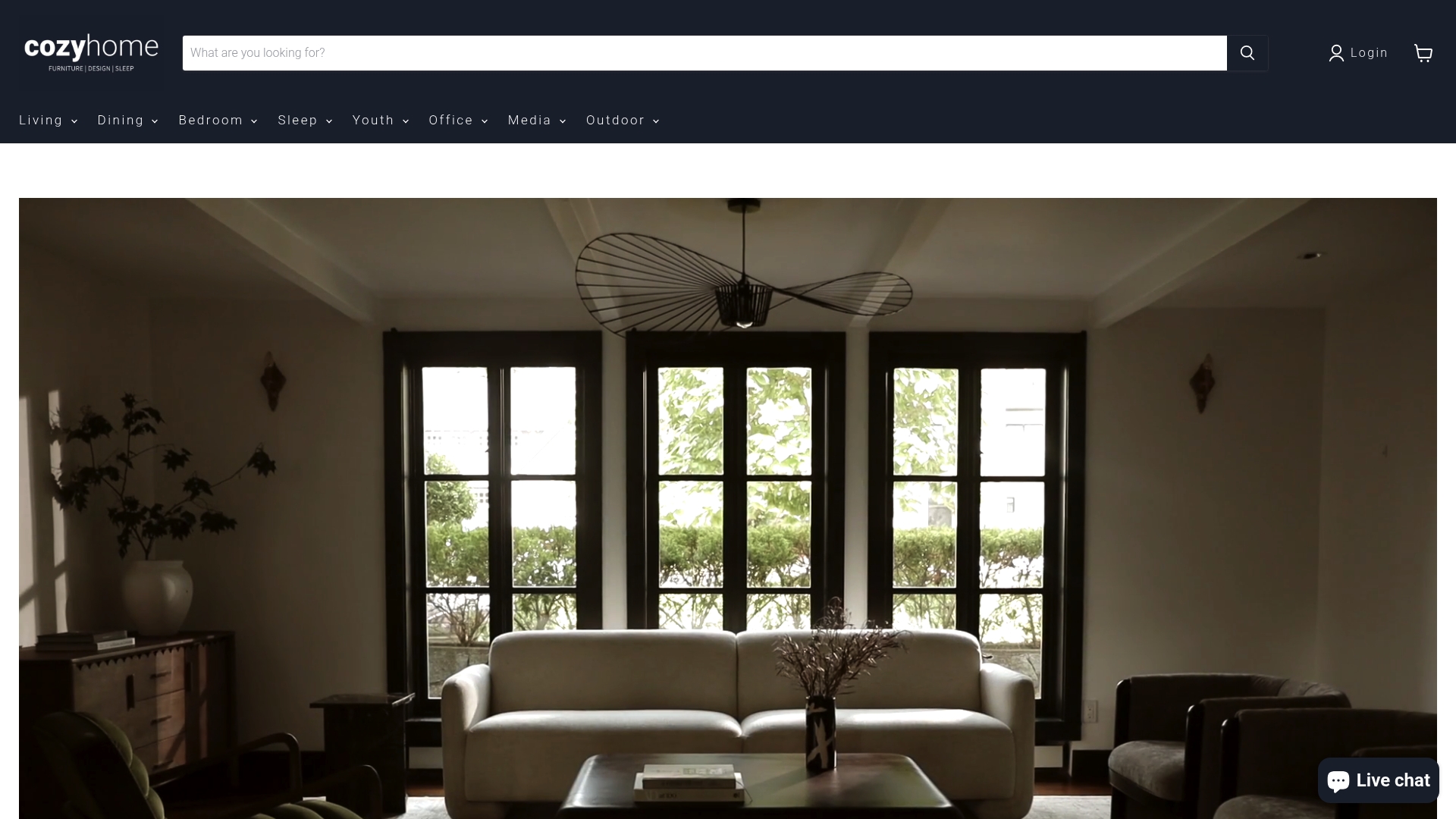
Whether you’re drawn to a warm oatmeal like our June sofa or a deeper shade like our Koba sofa in black, our team can walk you through fabric performance and colorfastness before you commit to anything. Start by browsing made to order custom furniture, order swatches, or stop by the showroom to see them under real light.
Sources
- How to choose a couch color according to interior designers | Homes and Gardens
- How to Choose the Right Sofa Color
- Color theory in interior design practice (IDI blog)
FAQ
What is the safest sofa color for a small living room?
Light, medium-value neutrals like cream, oatmeal, or soft gray tend to make small rooms feel more open since pale sofas visually expand a space. Pair the color with a rug or trim in a similar undertone so the room reads as connected rather than choppy.
Should I match my sofa color to my walls?
You don’t need an exact match, but the sofa should relate to the wall color in temperature and value. Many designers suggest starting from the wall and floor as the dominant tones, then choosing whether the sofa acts as a secondary color or an accent within that palette.
How do I know if a fabric will show stains easily?
Medium-value fabrics generally hide everyday soil better than very light ones, while dark fabrics hide stains most effectively but can show lint and pet hair more. For households with kids or pets, ask about performance fabric options and their cleaning instructions before you buy.
What is crocking, and why does it matter for sofa color?
Crocking is when dye rubs off a fabric onto clothing or another surface, and it’s more common in dark, saturated pile fabrics like velvet. Ask the retailer for the fabric’s ISO 105-X12 crocking grade for the specific colorway you’re considering.
Can I test a sofa color before buying it?
Yes, and it’s the step most buyers skip. Order fabric swatches, view them in your room across different times of day, and pin them against a white backing to check the true undertone before committing, a method our showroom uses with in-person guidance.